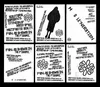
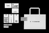
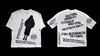
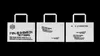
Mole’neration pursues a neutral, sculptural aesthetic, in the logo revamp, the four letter "M" blends modernity with a classic vibe. The brand's systematic text embodies a streetwise feel, with a layout style that mimics photocollage from a time without computers, and crooked text that is retro and vivid, evoking the bold impact the brand seeks.
- Art Direction, Typography Designer, Designer
- Yihao Wang