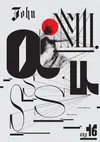
The weltformat poster designed for John Maus’s Providence concert responds to Maus’s simultaneous expressions of Medieval ecclesiastical-modes (formulas of melodic, rhythmic, early Christian chanting) and what Maus calls ‘today’s vernacular,’ contemporary pop. Interested in this contrast of sound and of history, the design focused on formal explorations of melody, harmony, sound projection, lightness and darkness.
Typographic inspiration came from Medieval heraldic devices, Gutenberg’s blackletter, and high-contrast Didoni typefaces often described as capable of portraying beauty. From the large, stylishly different display letters to the typeface made for secondary text, all forms were designed using divisible units. This allowed for a systematic composition that projects harmony. A custom Processing.JS script was written to create a stippled-like vector edition of the Virtue & Co.’s 1863 engraving of the vailed person.
- Designer
- Nick Adam